skincare made (more) simple
skincare made (more) simple
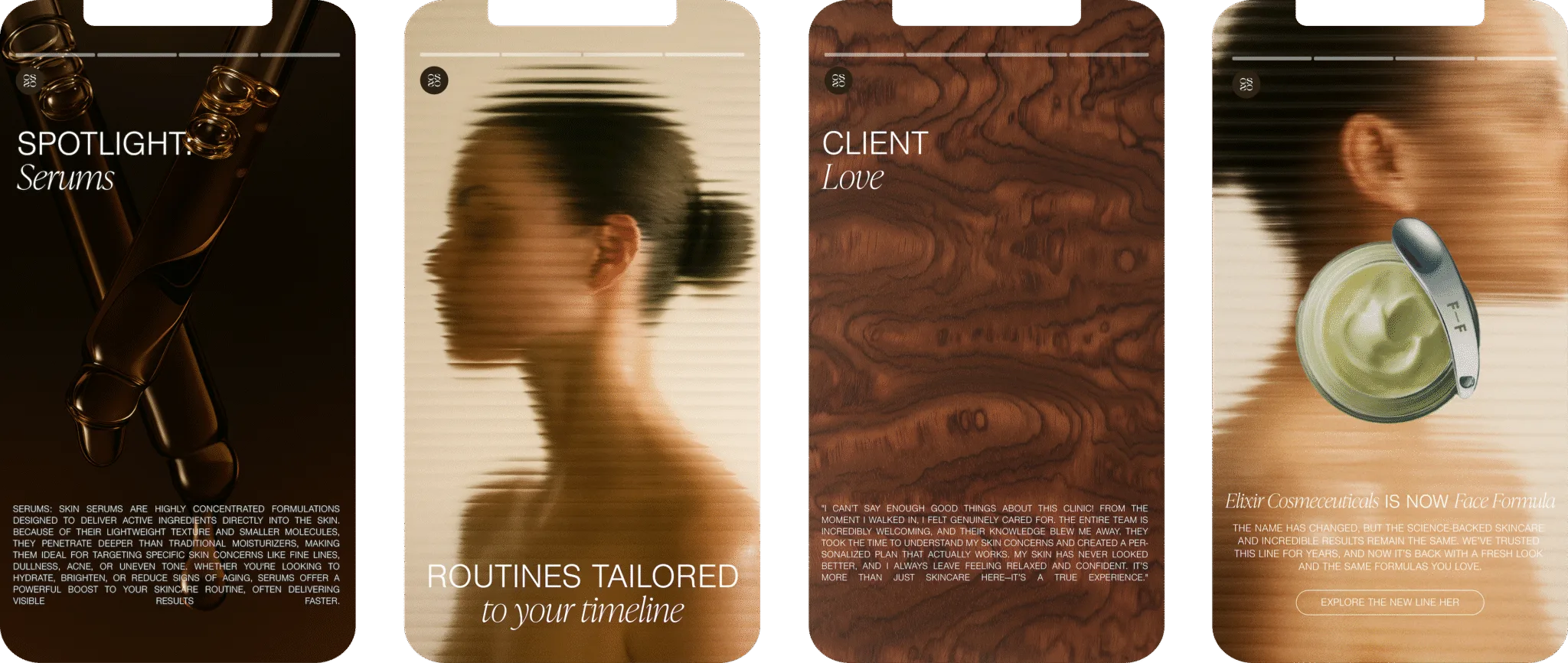
Oslo Skin is a clinic in Oslo specialising in advanced treatments that merge medical expertise with a welcoming, human approach. The rebrand was guided by the founder’s values and personality, with the goal of creating an identity that feels approachable, calm, and aligned with clients’ needs. Moving away from the sterile codes often associated with clinical aesthetics, the new direction emphasises warmth and simplicity, ensuring that every detail, from visual language to atmosphere, contributes to a cohesive experience. The result is a brand that communicates trust and refinement while remaining personal, inviting, and restorative, both online and within the clinic itself.
OSLO SKIN / 2023-2024
SERVICES
Brand Strategy
Visual Identity
Verbal Identity
Web Design
Web Development


Color Palette
The color system was designed to reflect the natural spectrum of skin tones while avoiding stark, clinical white. A foundation of soft neutrals such as linen, cream, and muted grey sets a calm backdrop, while a deeper taupe tone brings structure and definition. These shades shift gently with light, creating an environment that feels warm and alive rather than static. The palette was applied consistently across print, digital, and spatial elements, ensuring that everything from menus to wall tones carries the same visual softness. The overall effect is a brand environment that feels both clear and comforting, never cold.
Print & Packaging
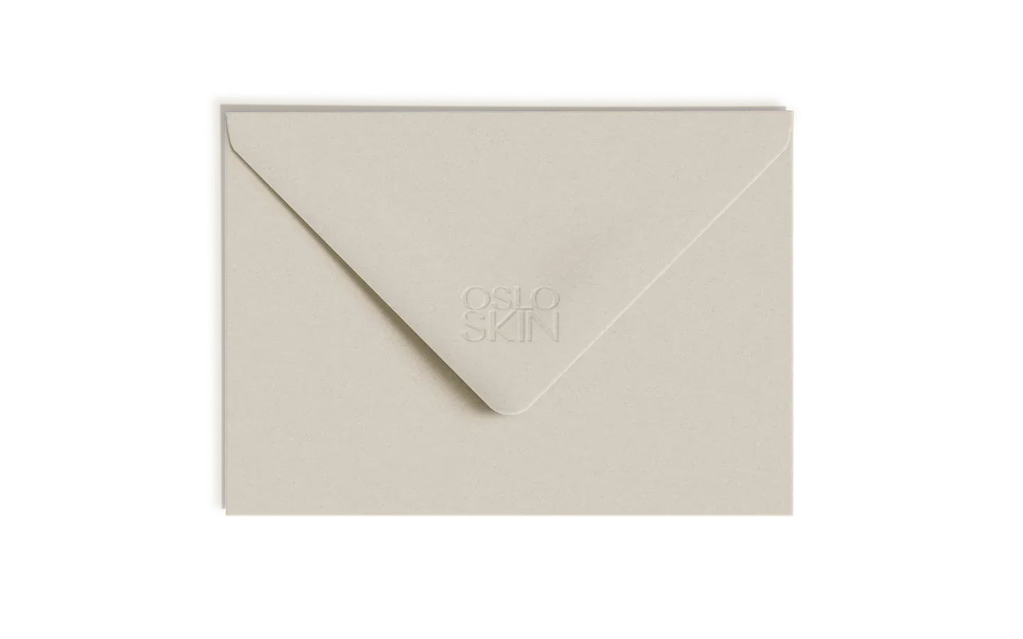
Print and packaging were developed as a natural extension of the visual identity, designed to feel as considered and refined as the treatments themselves. Minimal layouts, generous white space, and the interplay of serif and sans serif typography create a quiet confidence across every item, from appointment cards to treatment menus.
Material choices play a central role: uncoated and tactile papers, matte surfaces, and soft-touch finishes replace glossy or overly polished stocks, making each piece feel warm and human. Packaging follows the same principles, with understated structures elevated by thoughtful details, a ribbon handle, an embossed logo, or carefully weighted paper. Together, these elements transform the ordinary act of receiving information or carrying a product into part of the brand experience, reinforcing trust and attention to detail at every touchpoint.

Scent
Scent was developed as part of the brand system to ensure the experience engages more than just the visual senses. Rather than creating a signature fragrance, the focus was on guidelines that suggest calm and clean notes, herbal, soft citrus, or light woods, applied at a subtle intensity. The goal is to create continuity across reception and treatment rooms without ever overwhelming the space. By approaching scent as a brand element, Oslo Skin strengthens the idea that identity is multi-layered, engaging clients through atmosphere as well as imagery.
“We have worked with Julie for several years now, and we couldn’t be more satisfied. Her work on our website and all forms of digital marketing has made a significant difference for our business, and we greatly appreciate her attention to detail as well as her creativity. She have truly taken the time to get to know us, our brand, and our vision, earning our complete trust. We have received a very close follow-up and have felt well taken care of from day one!”
Sara T-L / Founder